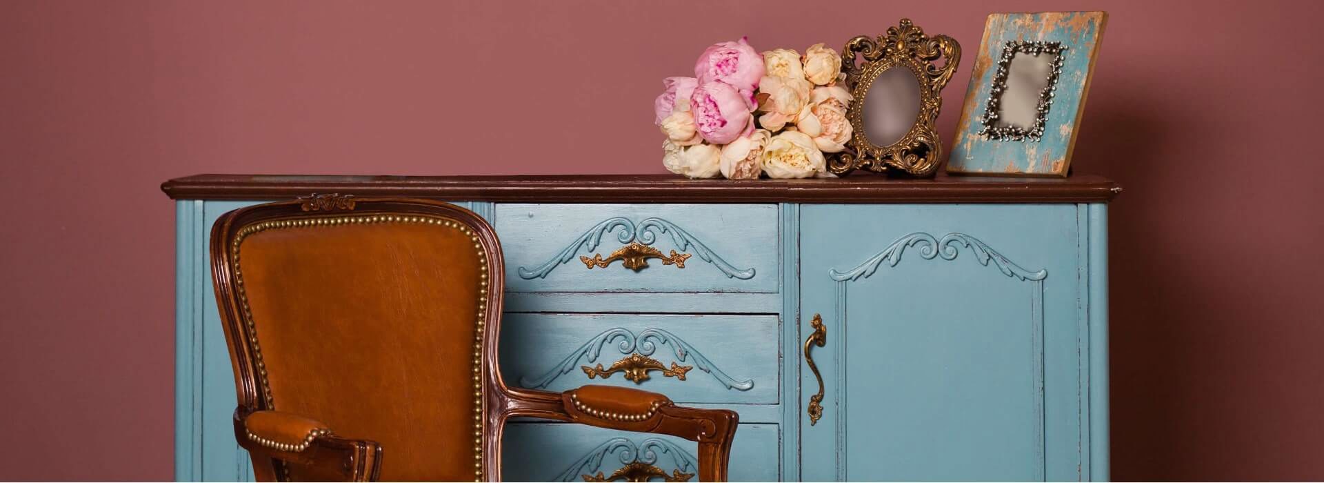
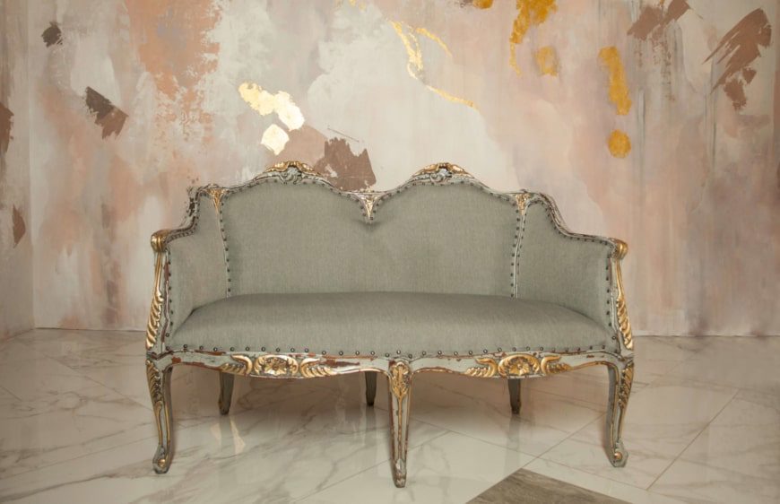
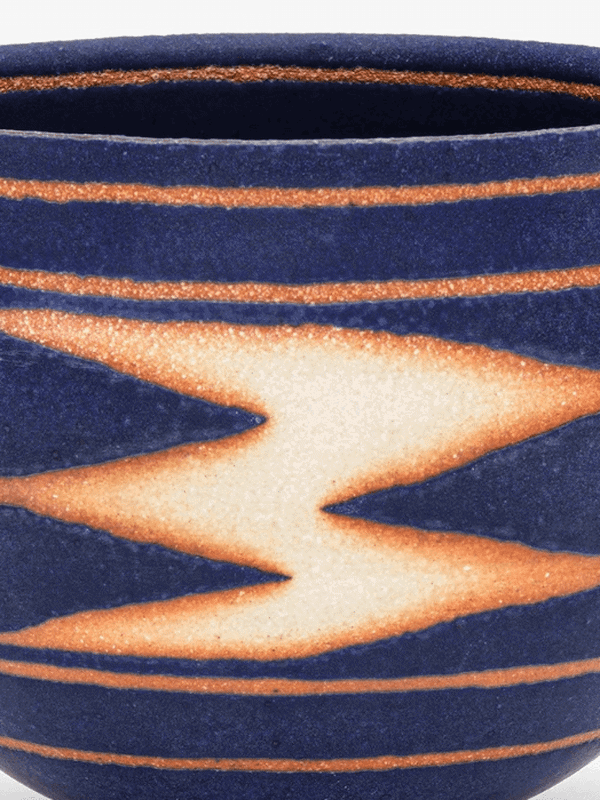
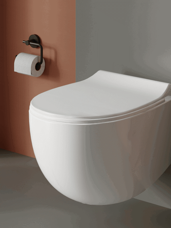
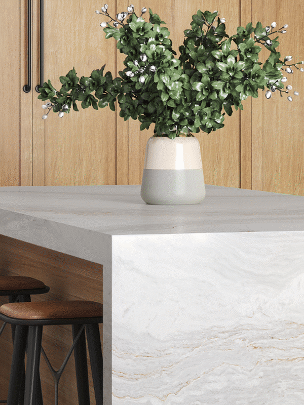
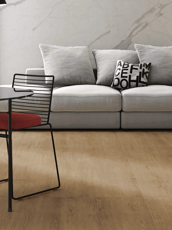
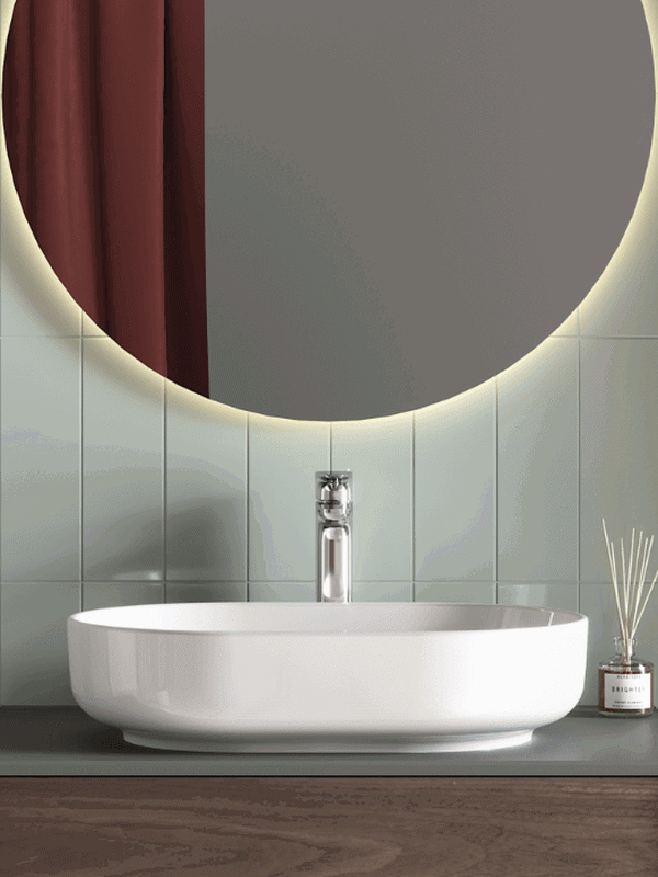
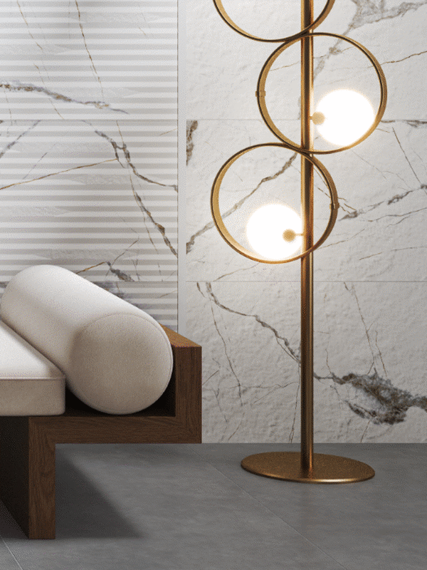
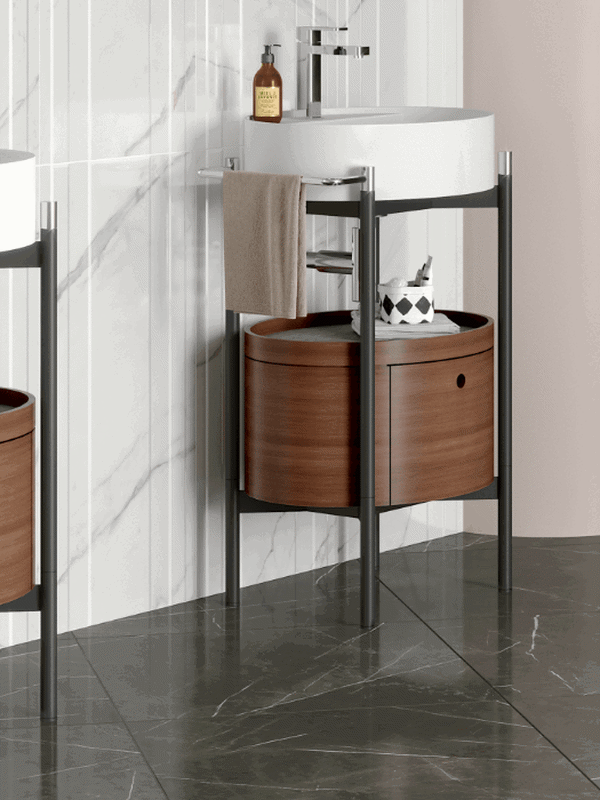
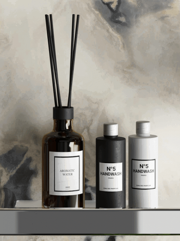
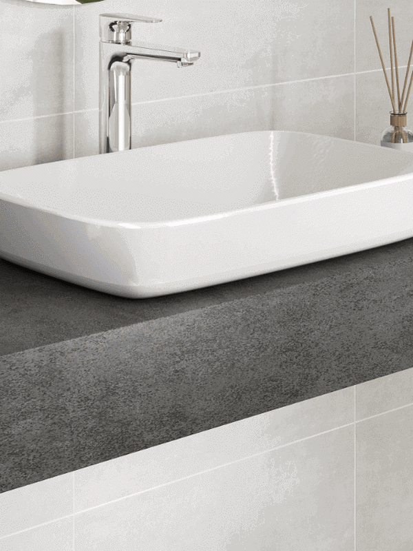
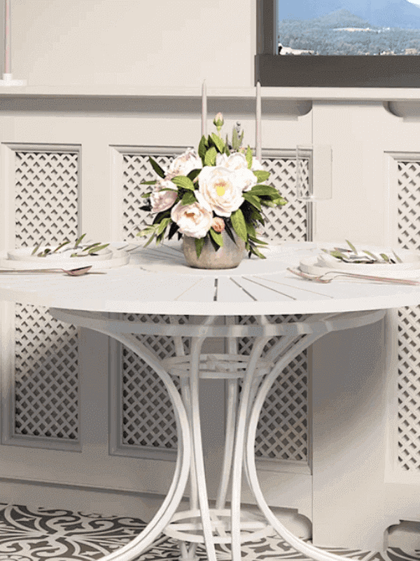
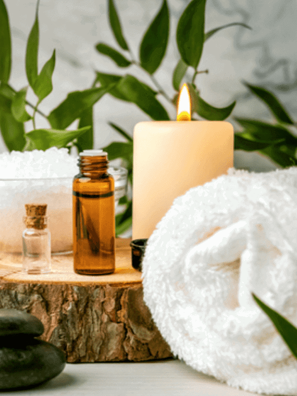
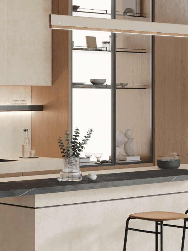
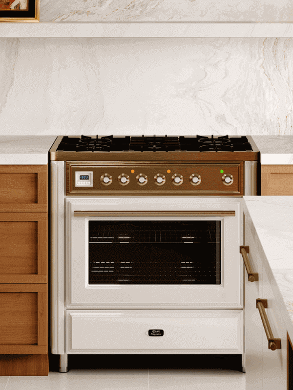
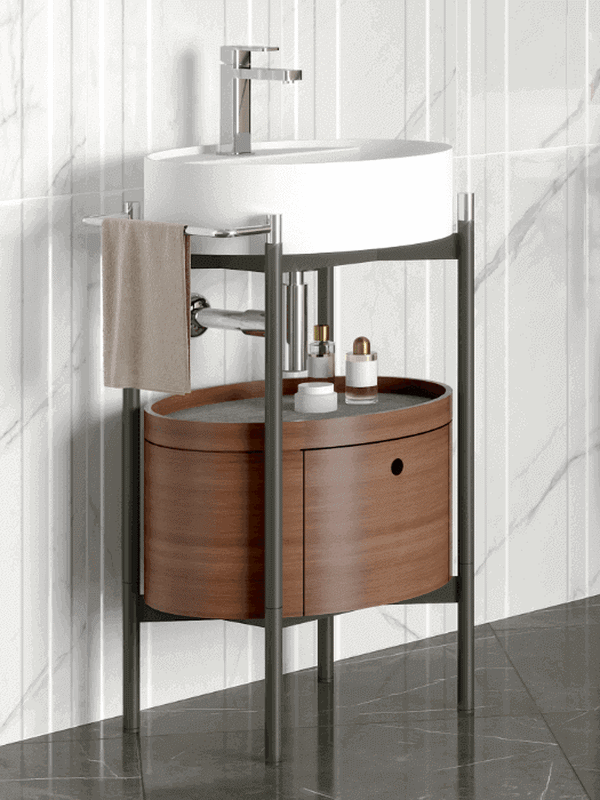
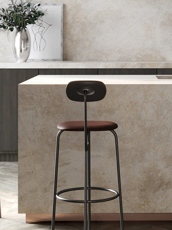
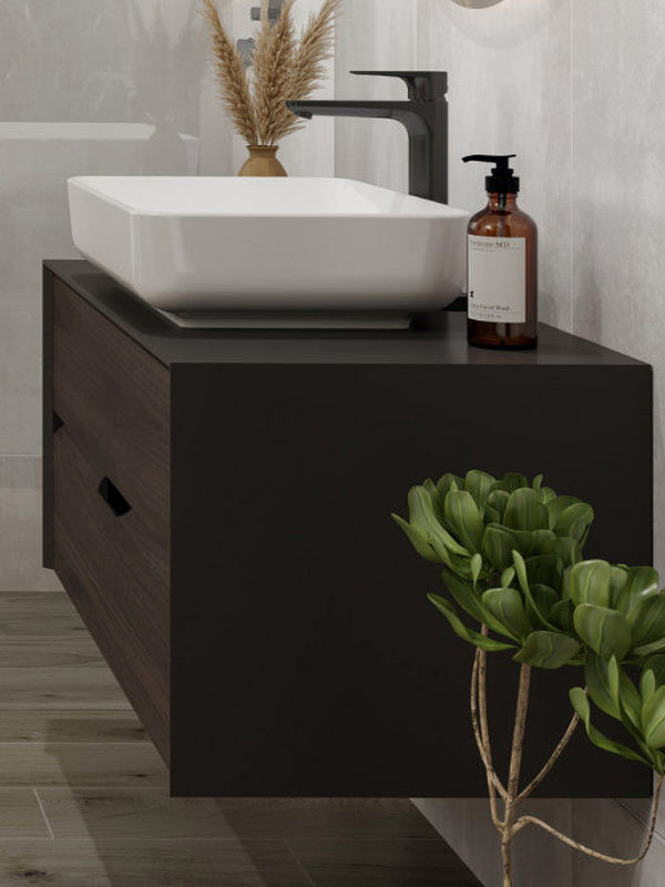
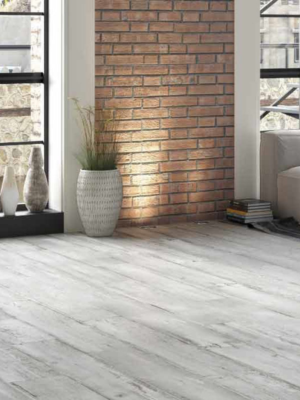
Brown is the first colour that comes to mind when we think of classic style. It features not only on walls and floors, but also in furniture and textiles. Yet an abundance of dark brown can make a room feel gloomy and dark. To prevent this, introduce touches of burgundy to lift the room’s energy.
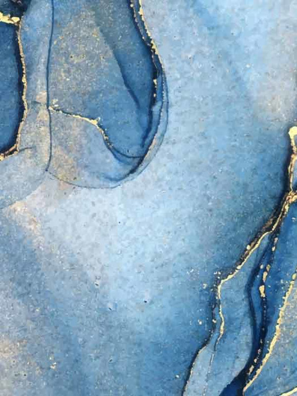
Favourite Colour Pairings in Classic Interior Design
We explore the decorative language of classic style through the right colour combinations.
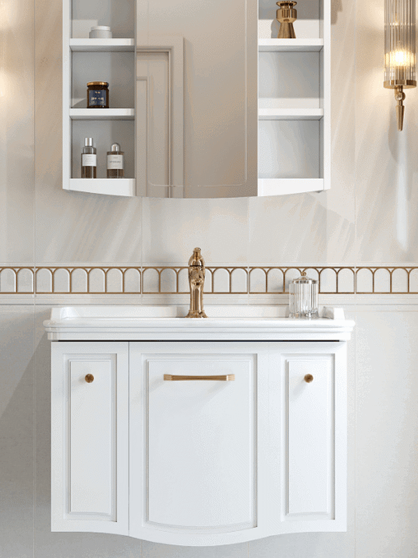
With its magnificent, striking, elegant and luxurious details, classic style has a timeless character that has endured for centuries. Trends come and go, but classic style remains. Indispensable to those who favour it, this aesthetic extends beyond interiors into clothing and ways of living. Colour is especially important in a classic decorative scheme. Balance the right combination well and you can create a successful interior. Pairing brown with burgundy, earth tones with beige, yellow or gold touches with an earthy palette, or dark green with cream helps you achieve a classic look that is easy on the eye.
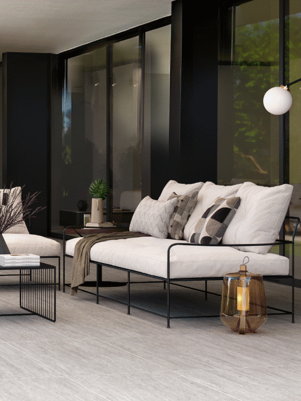
Brown & Burgundy
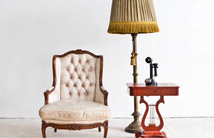
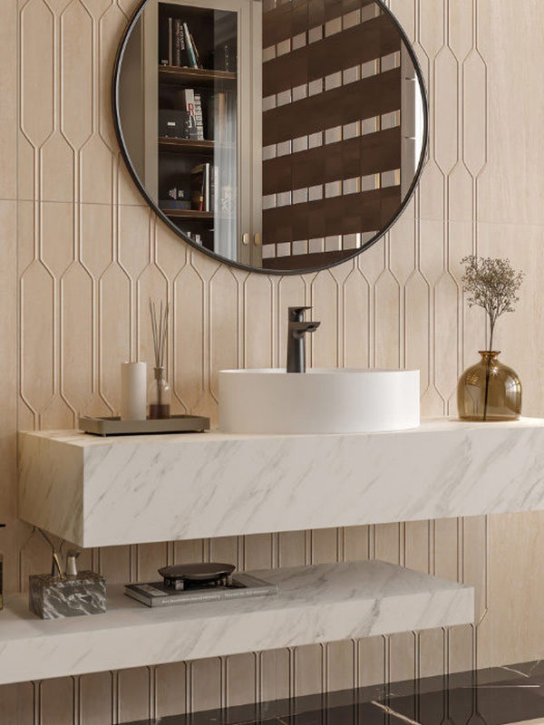
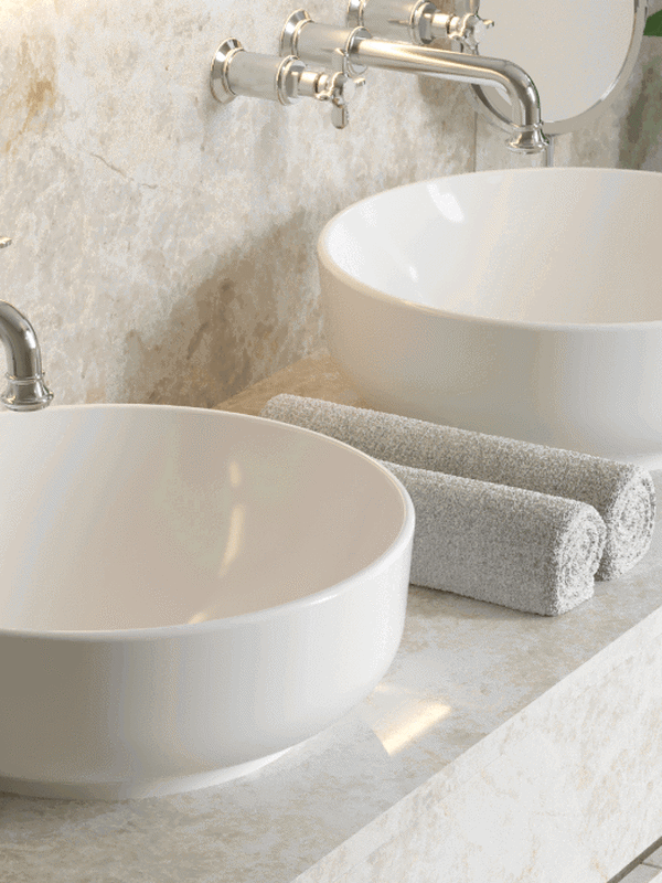
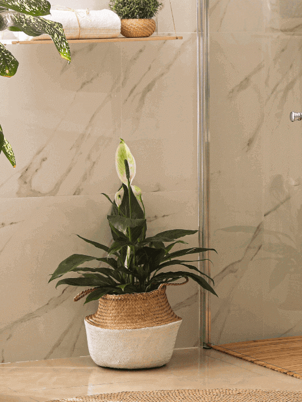
Beige & Earth Tones
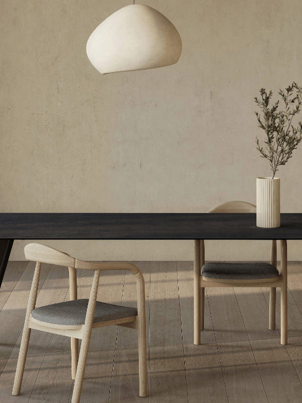
This colour group, which we would also recommend for a modern interior, signals a calm, elegant space. If you want a semi-classic feeling rather than an entirely classic one, draw on the spectrum of earth tones.
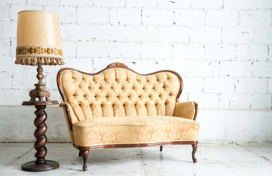
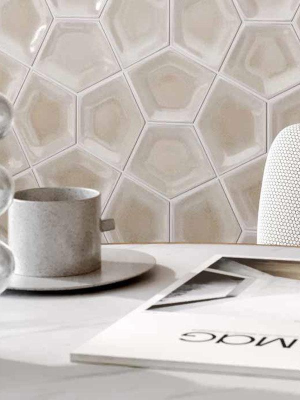
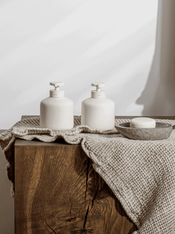
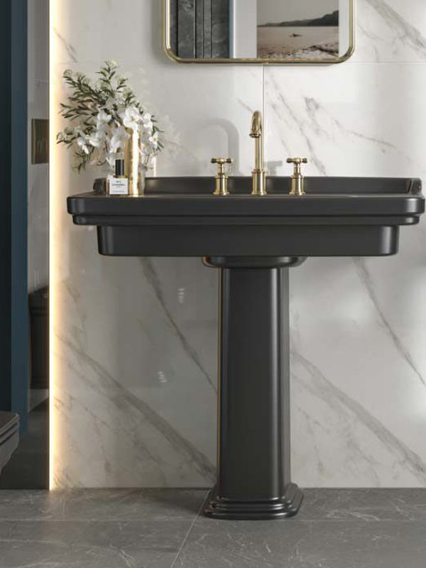
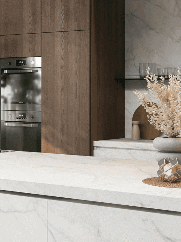
Yellow & an Earth-Inspired Palette
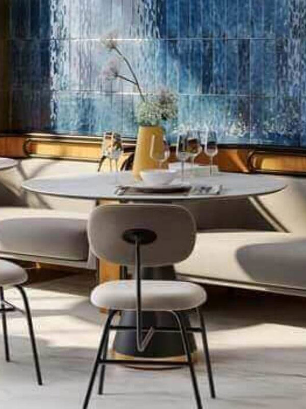
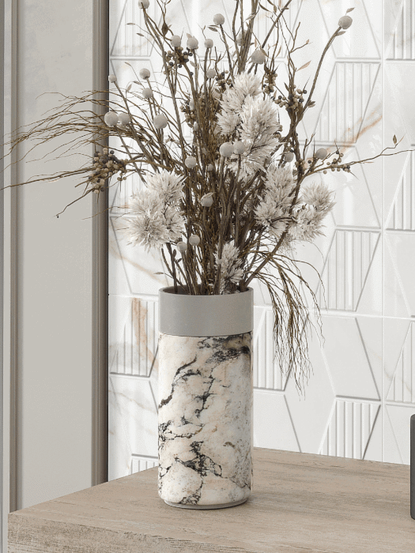
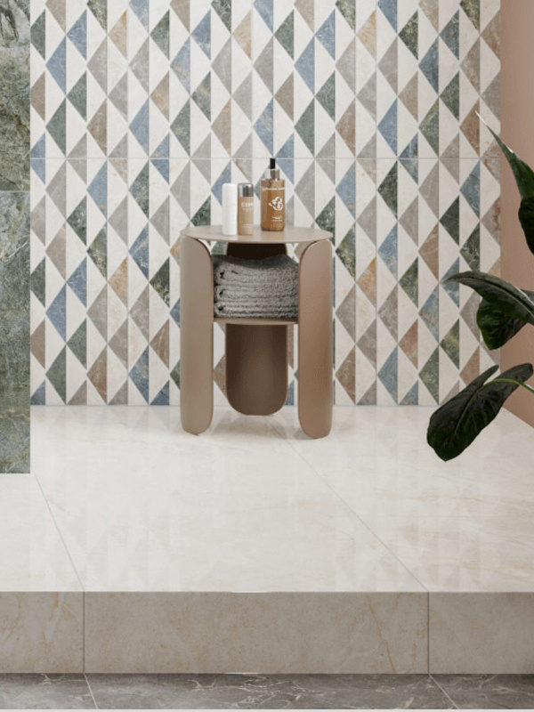
You can bring all the colours of the earth into this palette in pastel shades: blues, greens, yellow and orange… With this selection of contrasting colours, choosing beige and yellow as the main protagonists and using the other shades in cushions, accessories and curtains will help you create a well-balanced atmosphere.
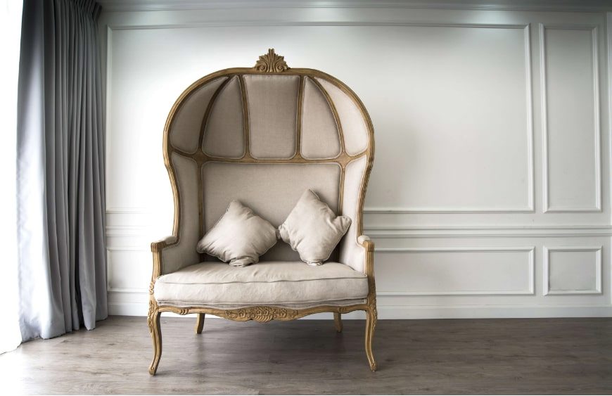
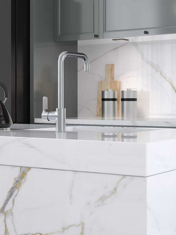
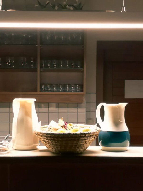
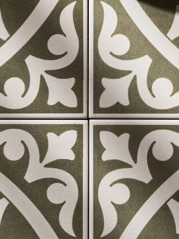
Green & Cream
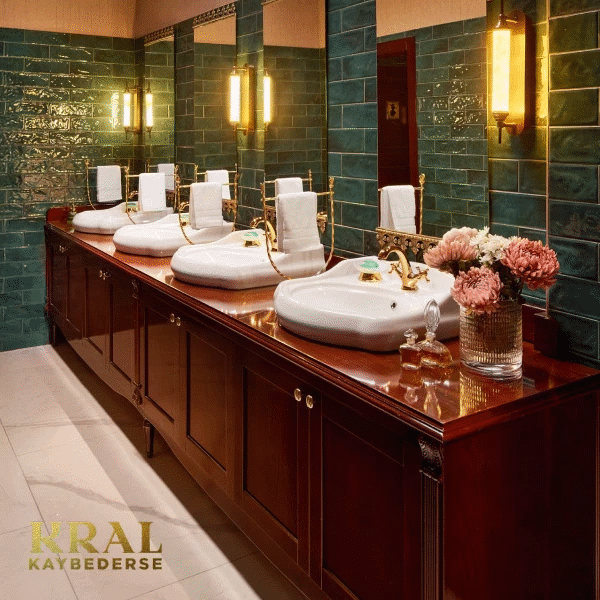
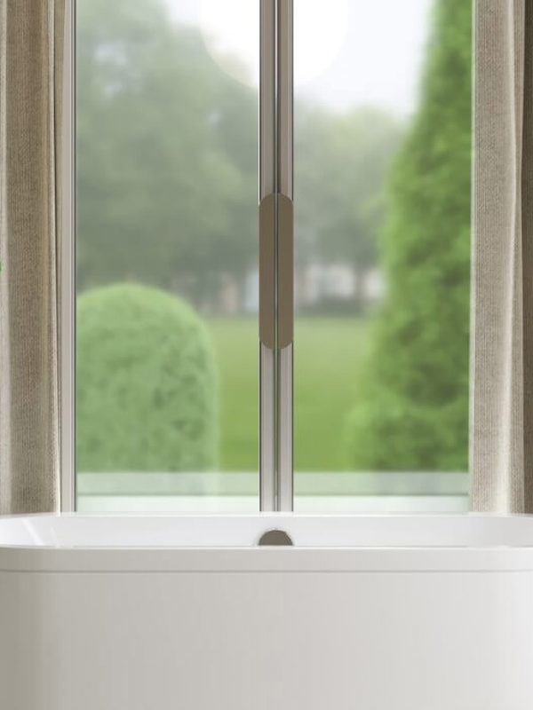
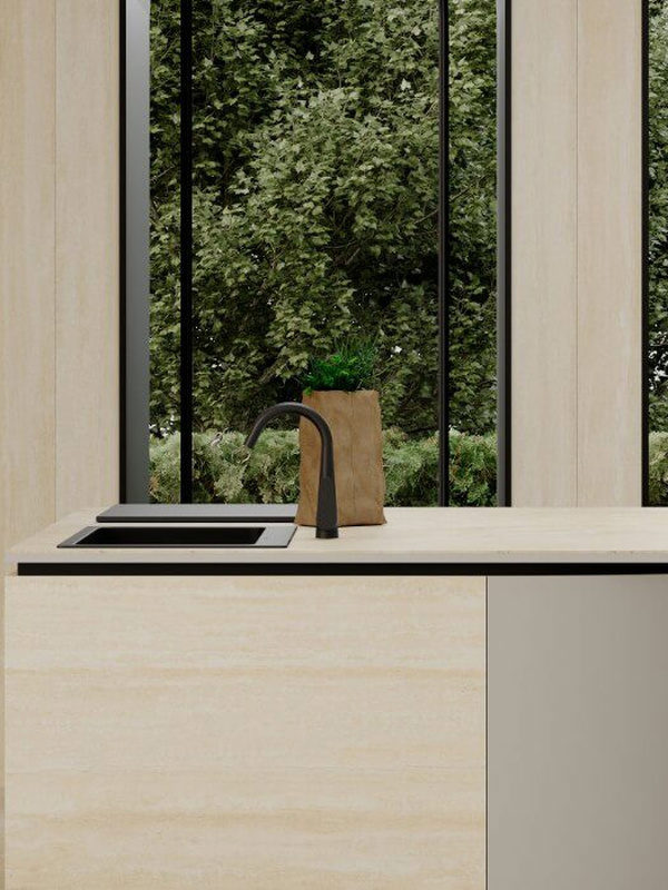
The sole criterion in choosing colour is feeling. What do you want to convey: character, strength, calm or energy? Green, for example, can express each of these. If you wonder how opposing feelings such as calm and strength can meet in the same colour, the answer lies in its shades. A very pale green and a strong dark green evoke different feelings, just as they create different vibrations. Use dark green on a solid expanse such as curtains or a single wall, then repeat supporting touches elsewhere in the décor, much as a painter adds colour to a canvas, to achieve the right colour expression for classic style.