Kitchen décor and colour schemes therefore play a more important role than ever. Neutral shades or white may seem timeless, safe and classical, but adding warm colours can do more than enliven a space where you spend much of your time: it can also contribute to your creativity in the kitchen.
Colours That Make a Difference in Kitchen Décor
White is a classic choice for kitchen décor, and we all know it will never go out of style. Yet taking a small risk and introducing other colours can change the atmosphere, energy, pace and creativity within the kitchen just as much.
Large or small, the truth remains the same: whatever its size, the kitchen is the heart of the home, is it not?
Looking at how kitchens have evolved, we see that they have grown beyond places simply for cooking. They have become stylish spaces where entire days are spent: living, working, studying, relaxing and eating, with sofas and televisions becoming part of the décor.
Which Colours Create Which Kitchen Styles?
Pastels
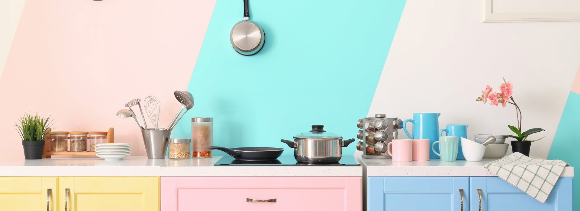
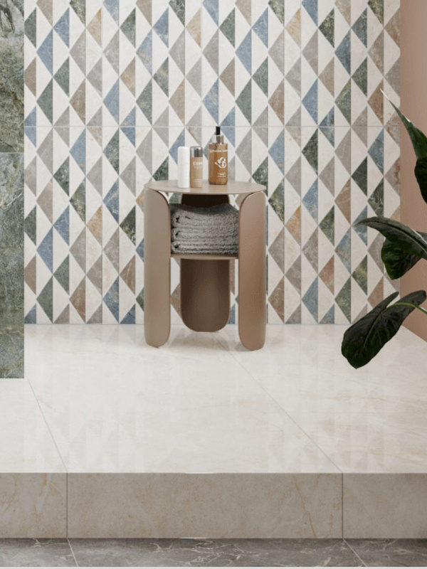
Romantic pastels can create a style that feels both retrospective and current. They are an ideal palette for those who want some colour in the kitchen but are hesitant about bright, bold shades. Adding soft, delicate chalky colours to a white-based kitchen creates a warm welcome, while low-saturation pastel combinations keep it bright and contemporary. For example, the pale pink and blue patterned tiles in Çanakkale Seramik’s Pera collection can create an effect that is both nostalgic and modern.
Colours That Create Depth
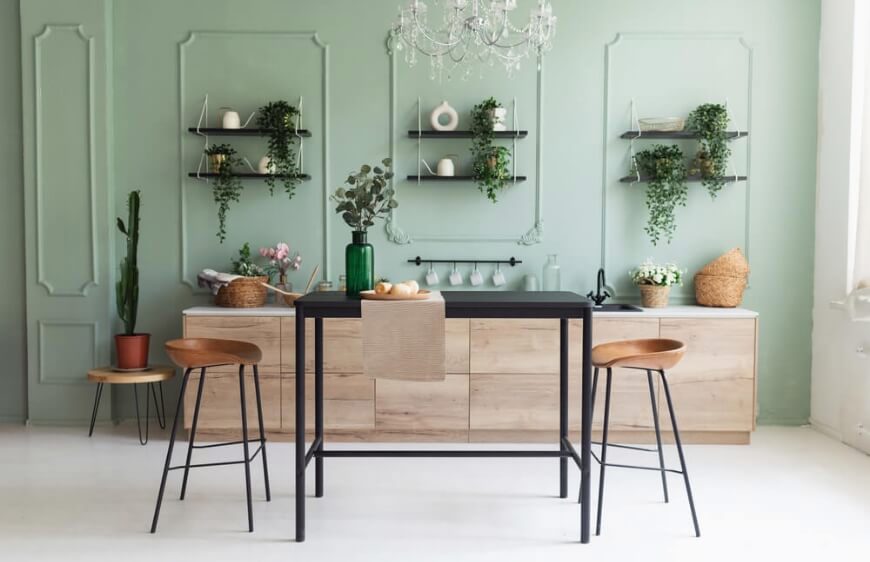
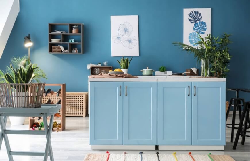
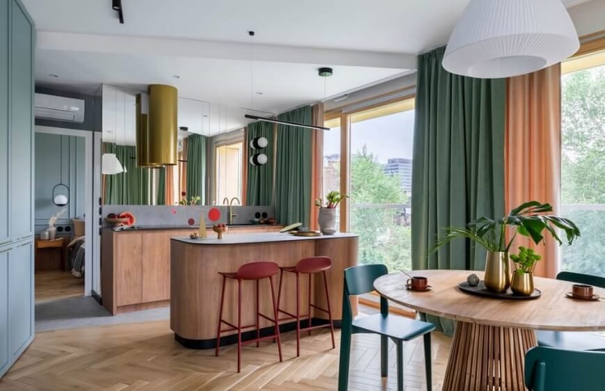
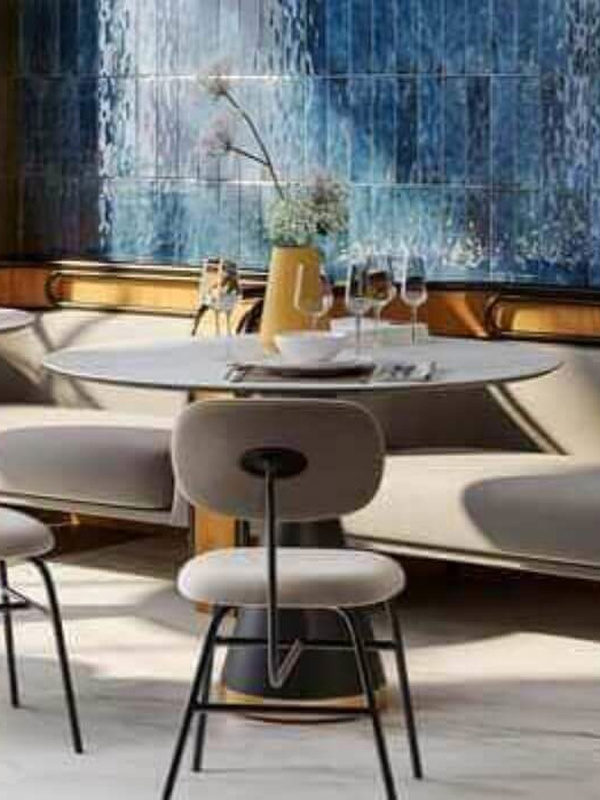
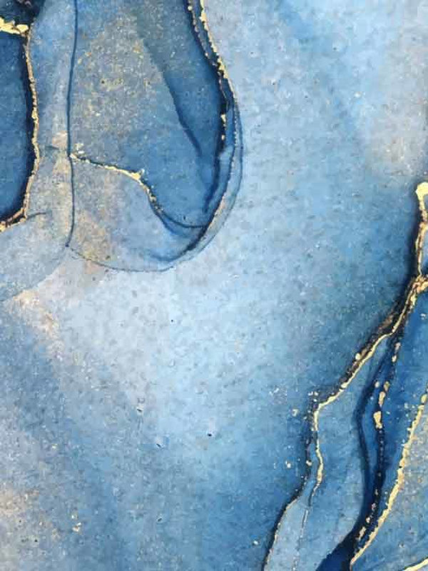
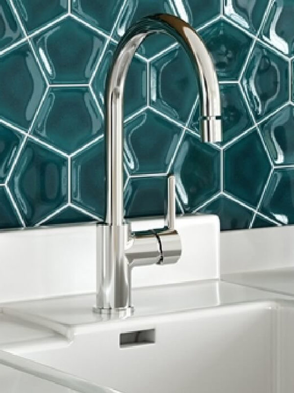
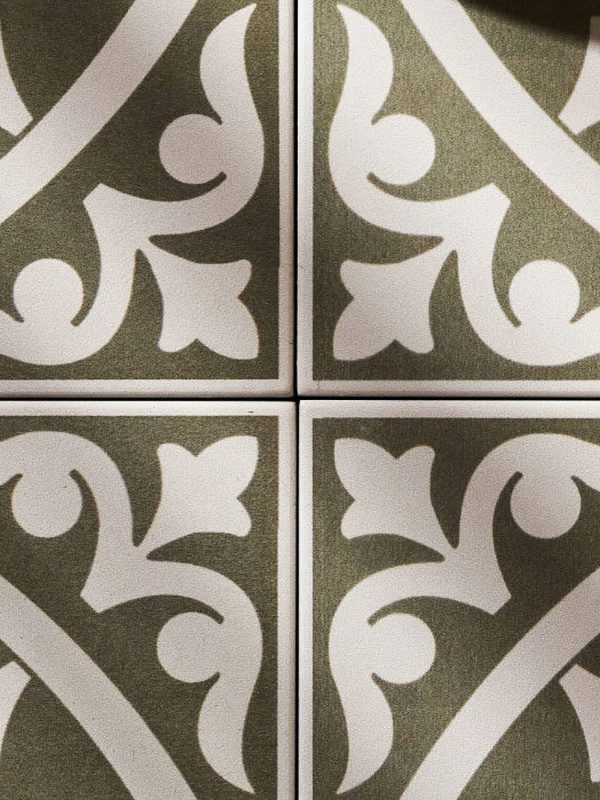
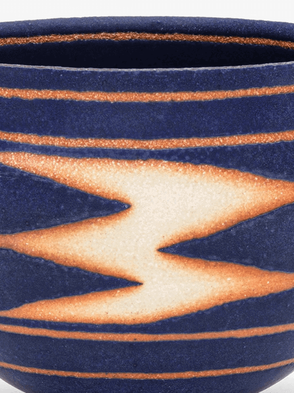
If you want to retain a calm, restful kitchen while adding a colour accent, combinations of blue and green inspired by the ocean’s depths may be the answer. Which one you use more heavily will guide the overall impression. Blues draw attention towards the cool side of the colour wheel, recalling calming blue skies, ocean waters and bright days. A pale blue kitchen can feel airier, larger and brighter. A green kitchen, meanwhile, can evoke a forest, a conservatory or being surrounded by nature. Bringing green inside is one of the easiest ways to give the kitchen a natural atmosphere. As you move towards darker shades of either colour, however, the kitchen and its focal area may appear smaller. Ideally, combine shades of both colours with purple and distribute them in a balanced way across different areas.If you would like to mix white with these depth-giving colours, consider Atria tiles from Çanakkale Seramik’s Formart collection for the splashback.Popular depth-giving colours: Grey-blue, Columbia blue, Academy blue, powder blue, sapphire, Prussian blue, asparagus green, moss green, teal, khaki, mint green, celadon green and, of course, sage.Styles they create: Vintage modern, Nordic neutral, Shaker.

Let Us Wake Up the Sunshine
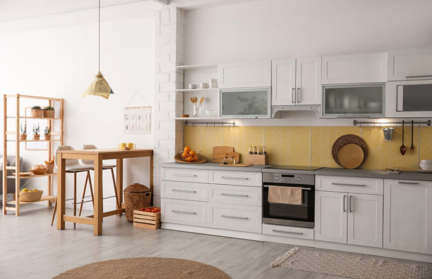
Why not invite the sunshine inside? Bright yellow is a bold choice, but used well it brings a sunny atmosphere to the kitchen. With a broad spectrum from barley yellow to rich honey, bright daffodil and lemon, yellow shades add depth and interest to a classical kitchen. They offer a soft, shaded, warm aura. Yellow’s association with gold brings a sense of family warmth and a love of cooking, turning the room into a peaceful, enchanting space. In natural light, the kitchen looks fresh and lively, creating a cheerful, energising atmosphere throughout the day. In the evening or under artificial light, these colours take on rich, sophisticated golden tones.Popular yellow shades: Amber, wheat, goldenrod.Styles they create: Modern country, Mediterranean, cottage chic.
Colours to Use Sparingly in Kitchen Décor
Red
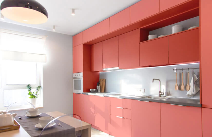
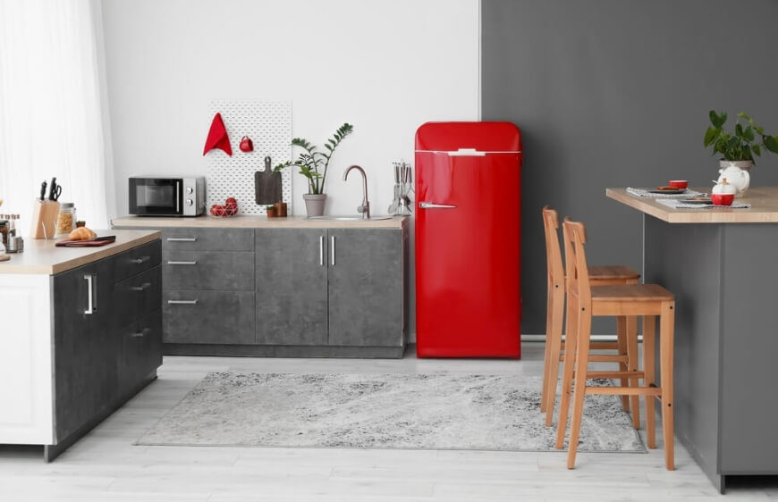
Red can positively influence emotions, increase productivity, activate the body’s inner reserves and lift the mood, yet it can feel tiring when used extensively in the kitchen. It draws attention to itself and, particularly in large quantities, can create pressure, stress and inner tension. Rather than making every cabinet red, we suggest using it on a single wall or in small accessories dotted around the room.
Dark Brown
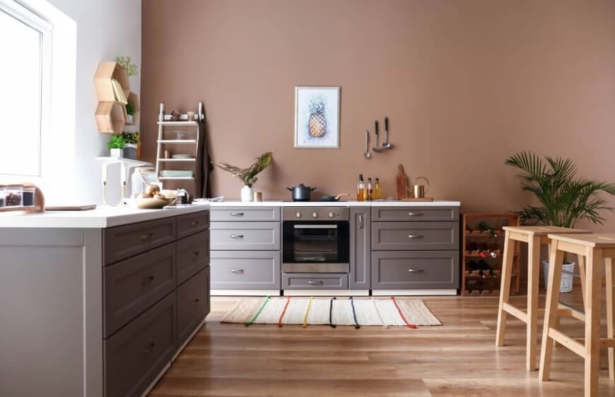
Unless it appears in wood textures such as dark walnut, dark oak, ebony or wenge, a matt dark brown kitchen can feel cold and dull. These tones convey a safe, conservative mood, but the last thing a kitchen needs is to lose its sense of comfort. If the room is small or poorly lit, dark brown cabinets can also make it feel smaller and enclosed. Light-coloured elements are needed to balance dark brown schemes. If you enjoy brown tones, try a warm café au lait shade or choose on-trend pale wooden cabinets. The contrast between light wood and a dark colour can be striking.
Other Ways to Add Colour to the Kitchen
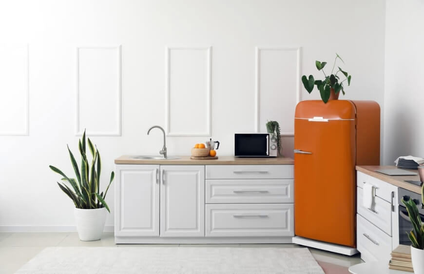
Changing the colour of your kitchen cabinets may not be on your agenda. In that case, you can introduce colour in other ways. Choosing colourful small appliances, for example, can create an accent. Or try the following ideas:
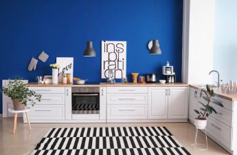
A Contrasting Wall:
Painting one wall in a contrasting colour that differs from the overall kitchen palette can make a real difference. You could also use wallpaper instead of paint, turning this area into the kitchen’s focal point.
A Simple Curtain Change:
One of the simplest ways to introduce colour is to change the curtains. Especially in a neutral kitchen, a small burst of colour around the windows brings energy, cheer and creativity.
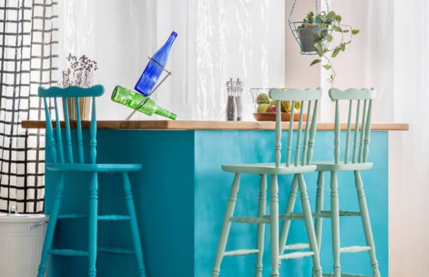
Painting the Chairs:
If your kitchen has a dining nook, painting the chairs in different colours can be a creative way to add an accent. You could even use different shades of one colour to introduce depth. If the chairs are not suitable for painting, change their covers or choose new seat cushions.
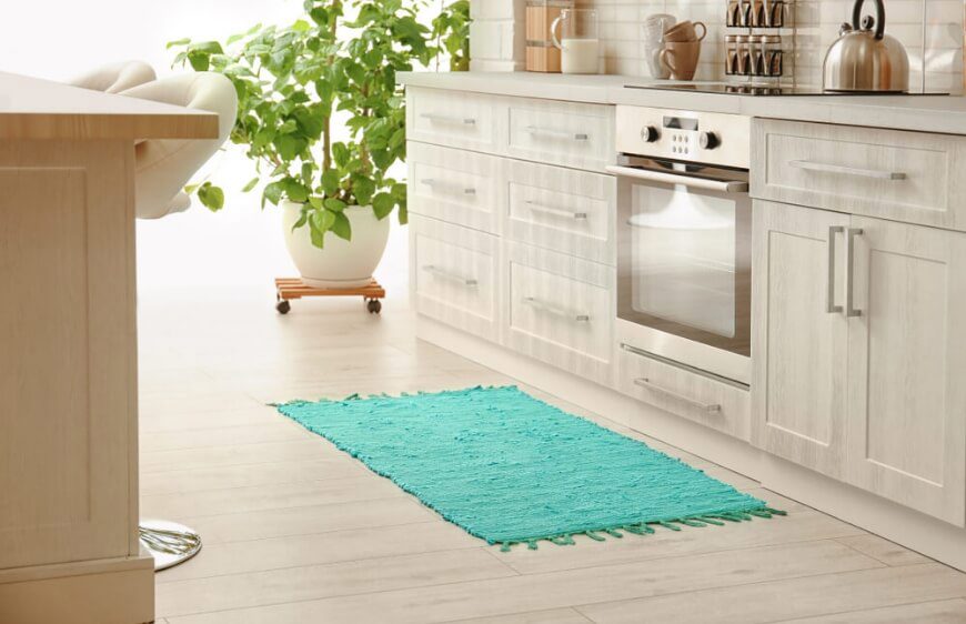
A Rug or Kilim
Many washable kitchen rugs and kilims are available today. To balance colour throughout the space, carry accents from vertical surfaces down to the floor. Repeat a colour used in accessories or fabrics in your kitchen rug or kilim.
Lighting
Colour in kitchen lighting requires some care, as the light may take on the colour of its shade. Try coloured lighting before buying it. Pendant lights are the best choice for the kitchen.