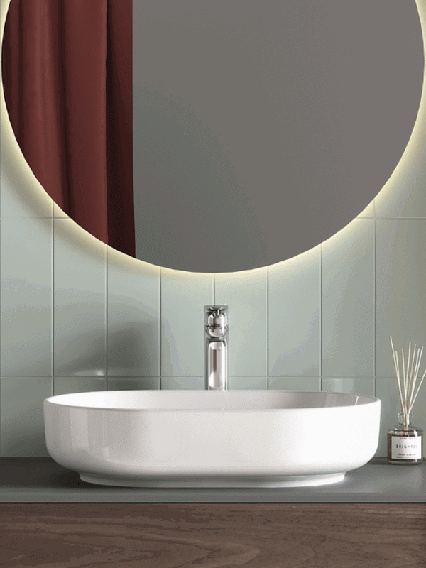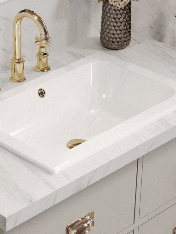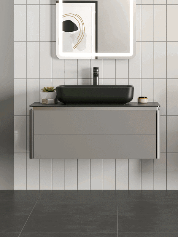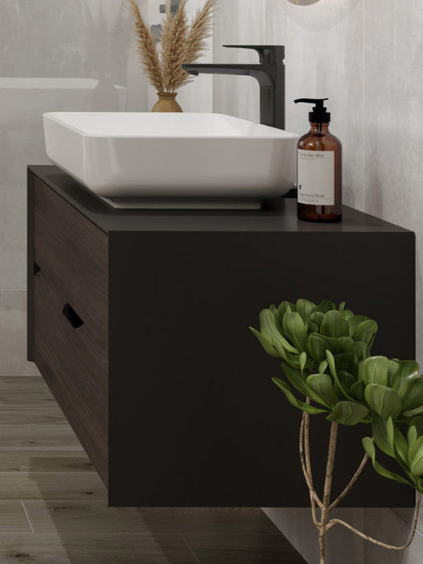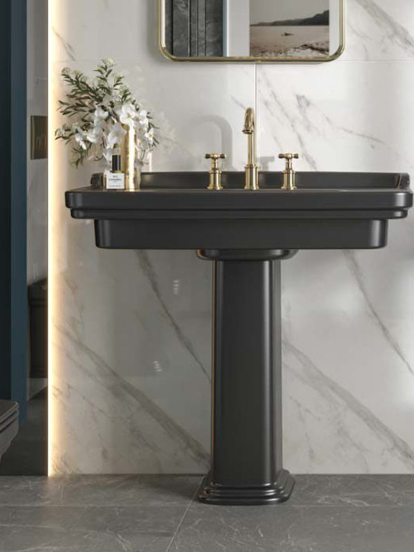
Bathrooms have their own place within interior colour trends. As the changing and expanding roles of next-generation bathrooms come onto the radar of trend authorities, thematic colours and spaces emerge.

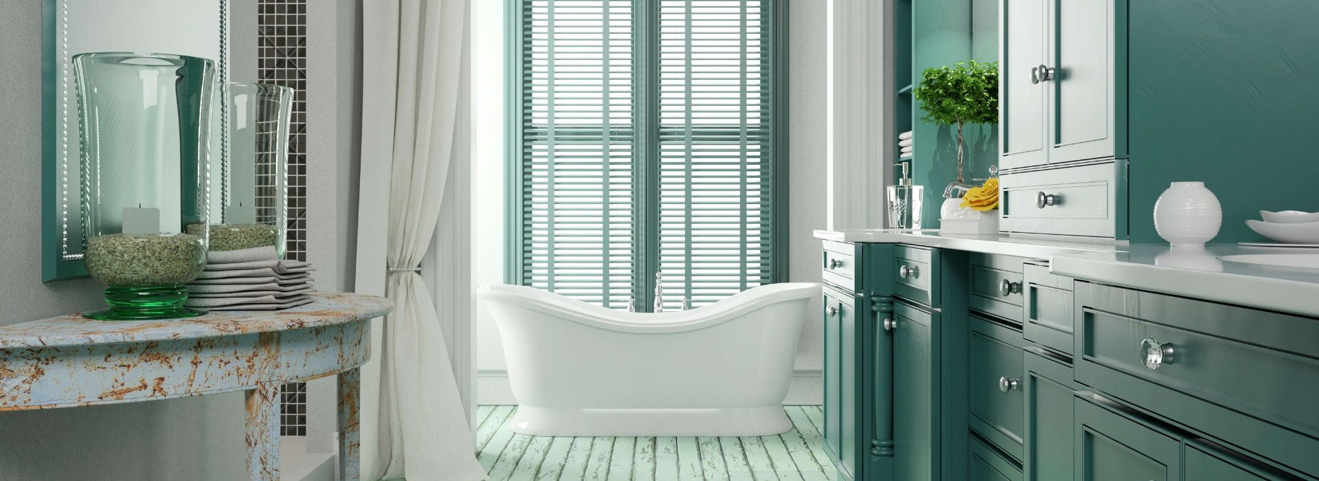
The bathroom colour trends forecast by trend agencies for the 2021–22 season bring philosophy, individuality and style to interiors.
Interior trend forecasts prepared by professional agencies using global sociological data are eagerly awaited for their insights into the homes of the future. Having set out in the first half of 2021 with findings relevant to every living space, trend agencies have also developed new palettes for the second half of the year and for 2022. These are more than simple colour ranges: they relate directly to people’s physical and psychological expectations of life at home. A particular philosophy underpins each one.
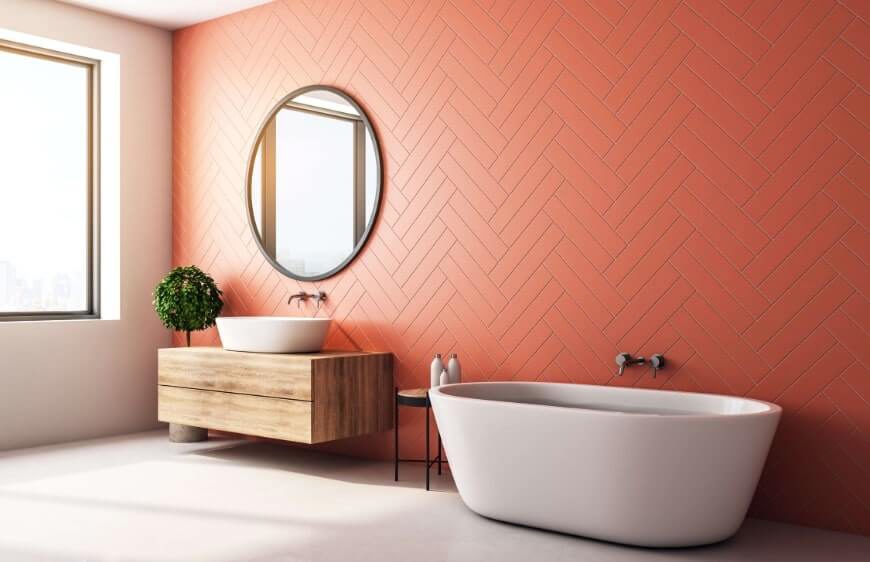
Bathrooms have their own place within interior colour trends. As the changing and expanding roles of next-generation bathrooms come onto the radar of trend authorities, thematic colours and spaces emerge.
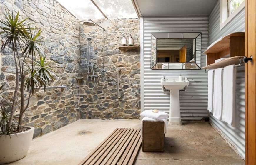
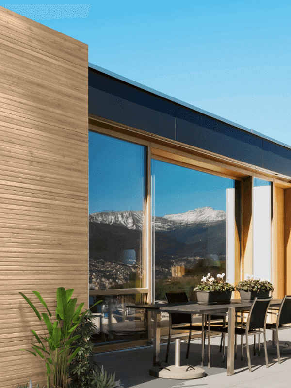
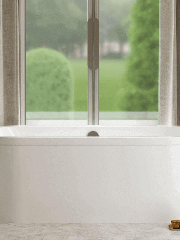
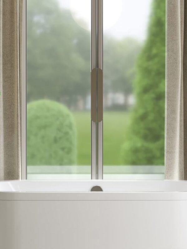
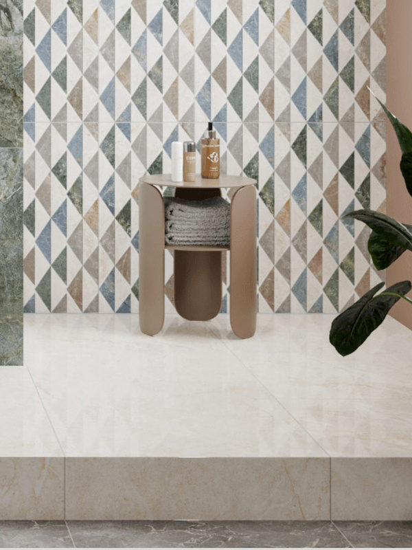
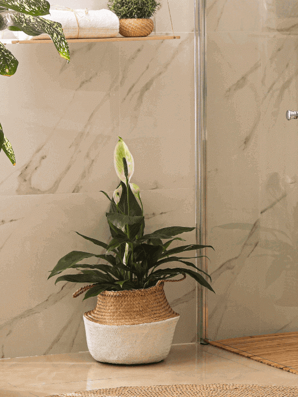
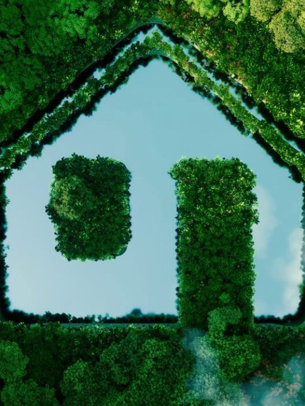
Our irrepressible longing for close contact with nature and the environment suggests that we will continue towards spaces that almost entirely dissolve the boundaries between indoors and outdoors. Bathroom décor that evokes gardens, forests and seas through atmosphere, even when the walls remain, helps to ease this longing.
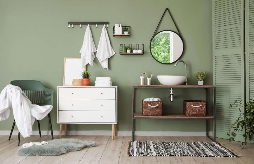
The first step towards giving natural elements such as daylight, natural surfaces, organic forms and living plants a greater place in the bathroom is to establish a palette that makes the experience more authentic.
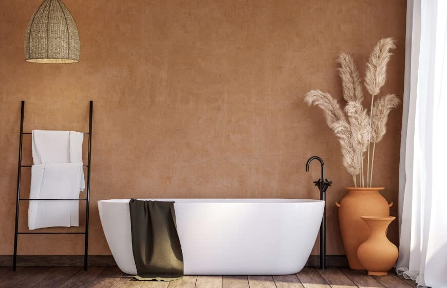
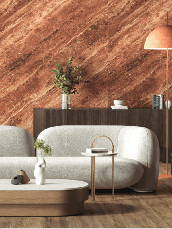
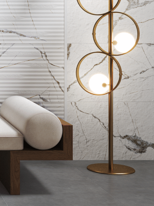
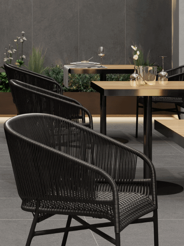
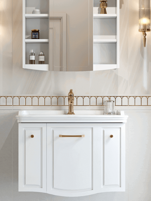
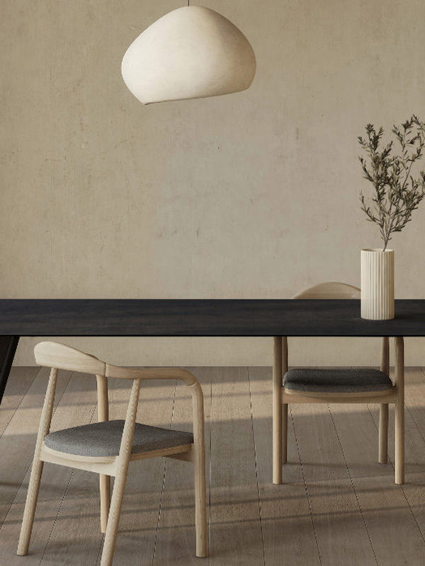
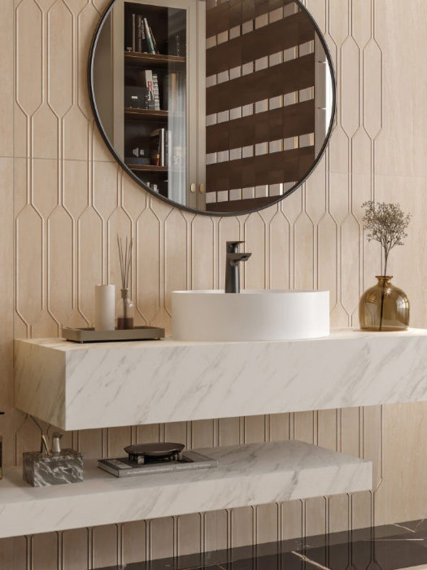
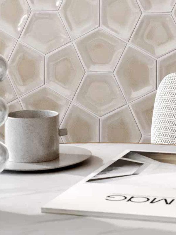
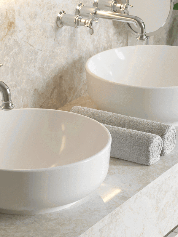
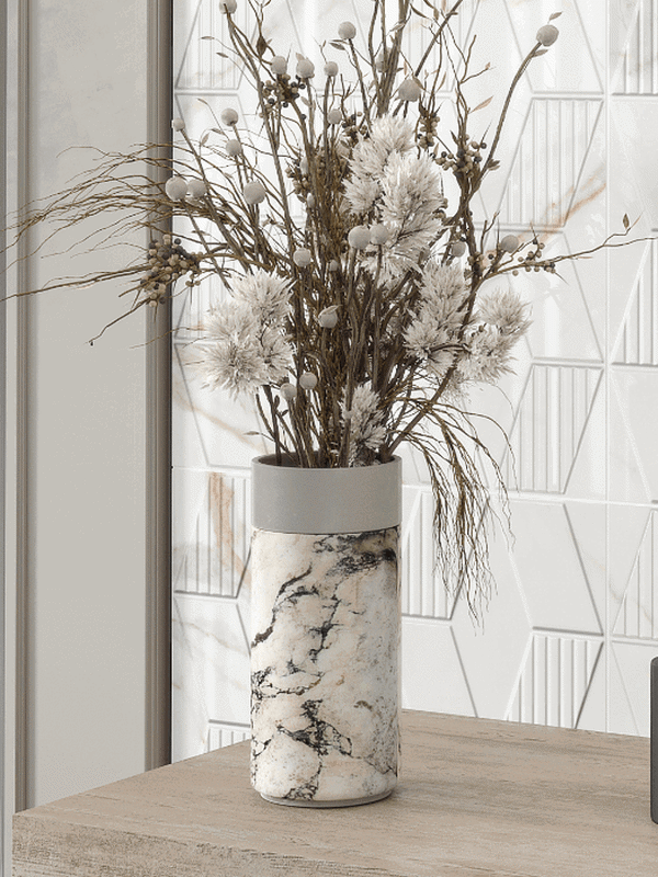
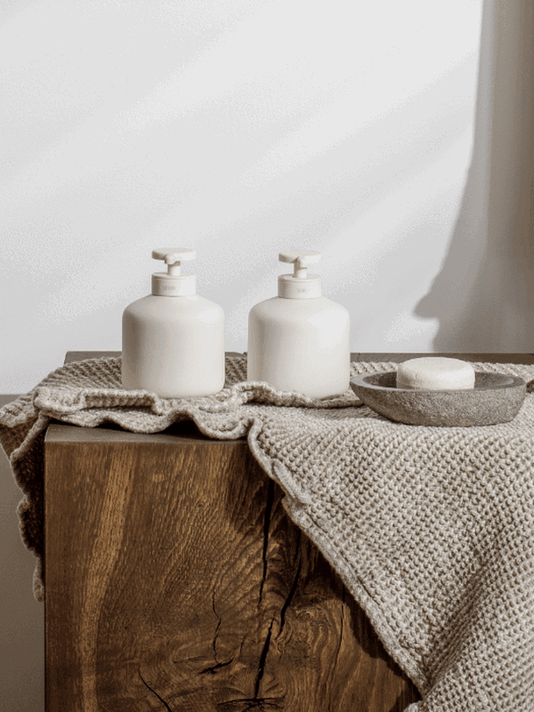
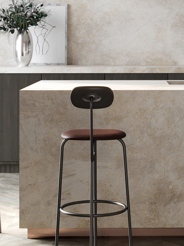
Earth colours will be the palette of greatest interest to bathrooms seeking a connection with nature. Complemented by neutral stone, clay and concrete shades, it features cream, sand and ivory as cool tones, alongside warm earth, brown, cinnamon, turmeric, saffron, russet and dark green.
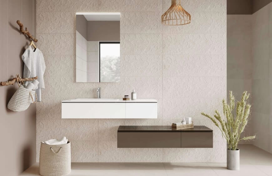
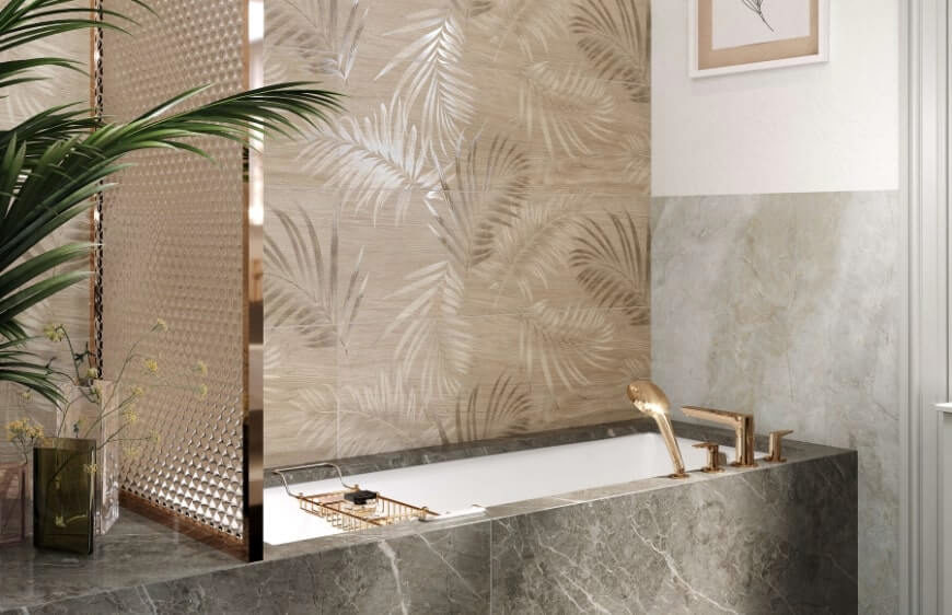
This romantic palette lifts the psychological weight of the difficult, gloomy pandemic years of 2020–21 and calls us towards happier times, offering hope, pleasure and happiness. Inspired by Japan’s famous cherry blossom, sakura, it places pink and the full range of blush tones at the forefront. Heralding spring and symbolising renewal and hope, sakura occupies a similar position in colour psychology: as a positive colour that inspires relaxing feelings, it soothes our sensory energy. Cherry blossom carries a slightly different meaning in China. Evoking love and mystery, its colours also hold an elevated status as expressions of beauty, strength and sexuality.
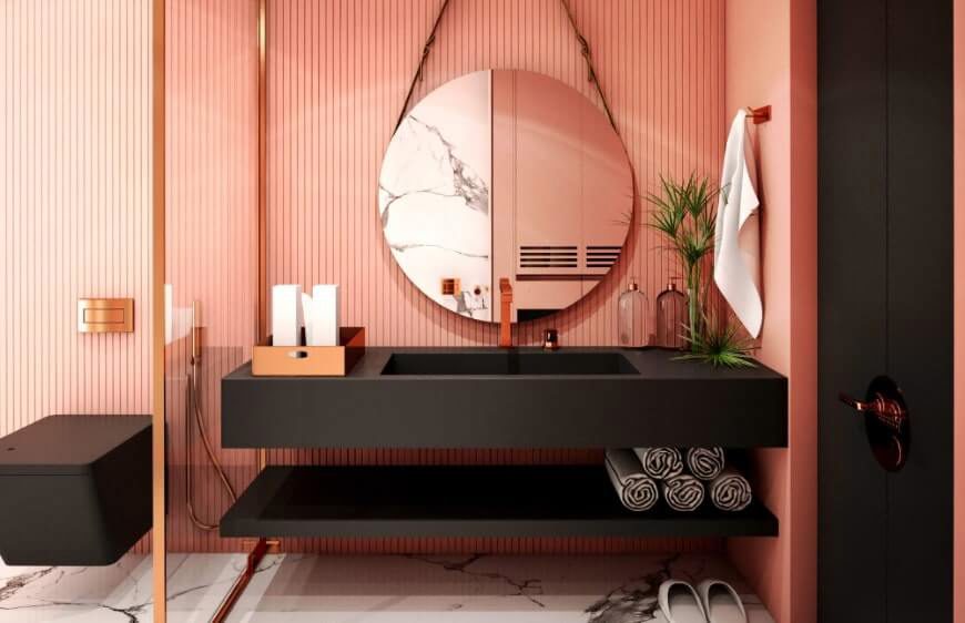
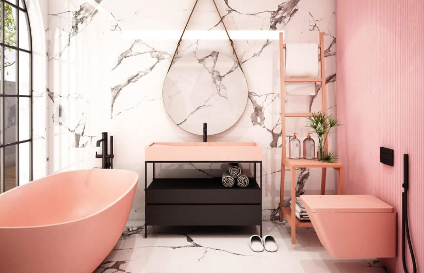
Let us explore the complementary palette for sakura pink, a calming shade scientifically proven to change one’s entire mood after looking at it for 20 minutes.
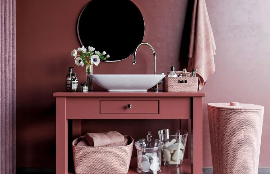
Often paired with milky white, sakura pink is used alongside champagne, Congo pink with a touch of yellow, blush, grey-infused Mountbatten, salmon and apricot. Complementary colours such as beige, pale turquoise and saffron yellow lead us towards a light, softly transitioning Florida theme.
After a year in which the need for security reached new heights, turning towards foods that offer simple sensory pleasures and lift the mood became one of the pandemic’s most distinctive habits. Through experiences such as the scent of a favourite fruit, the first spoonful of a homemade meal or the tactile satisfaction of a handful of nuts, we gave fulfilment a tangible form.
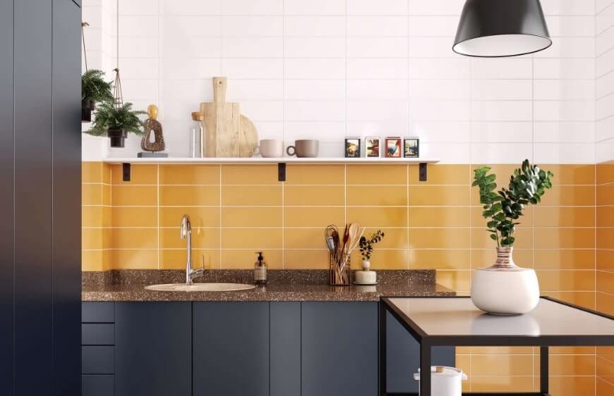
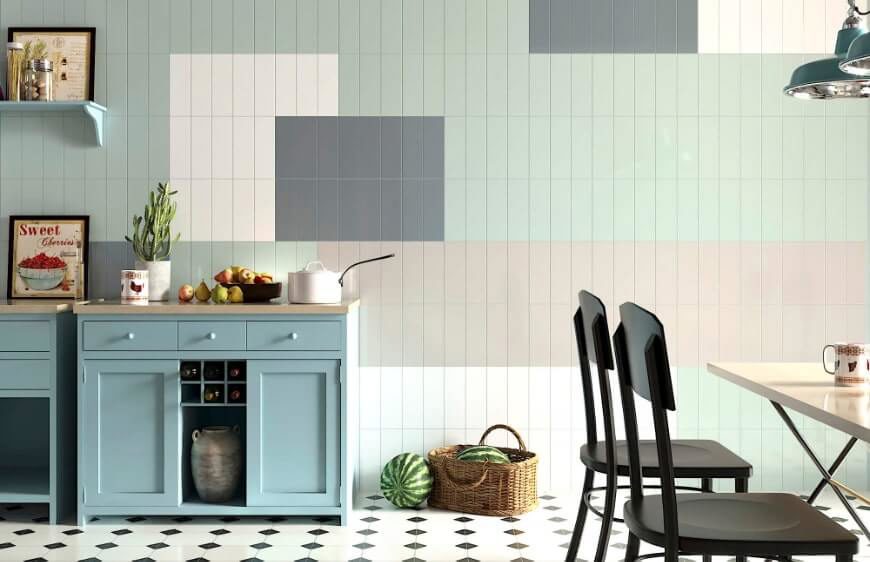
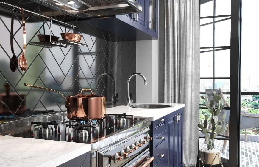
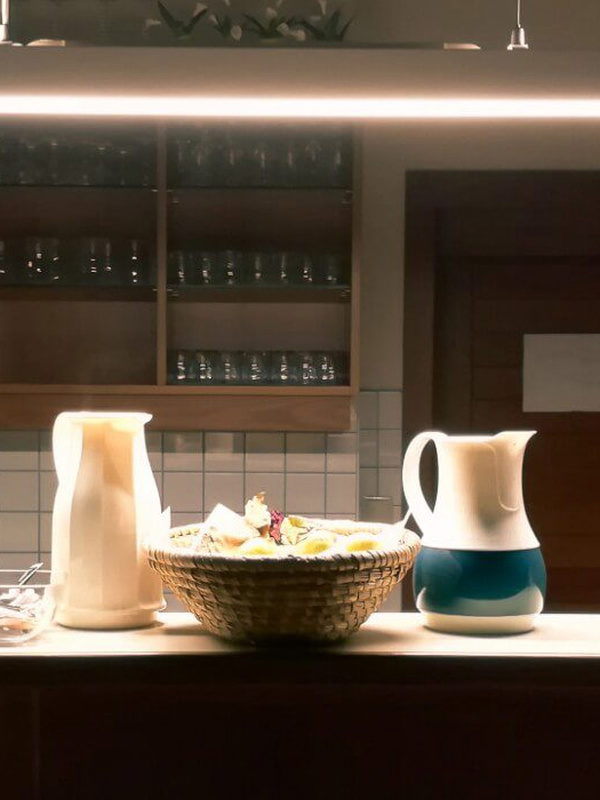
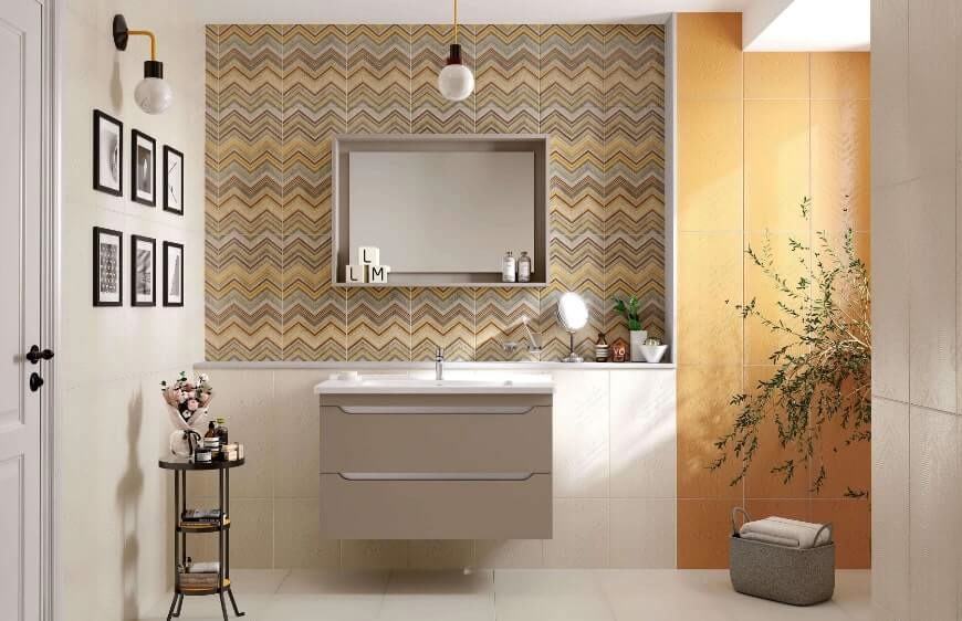
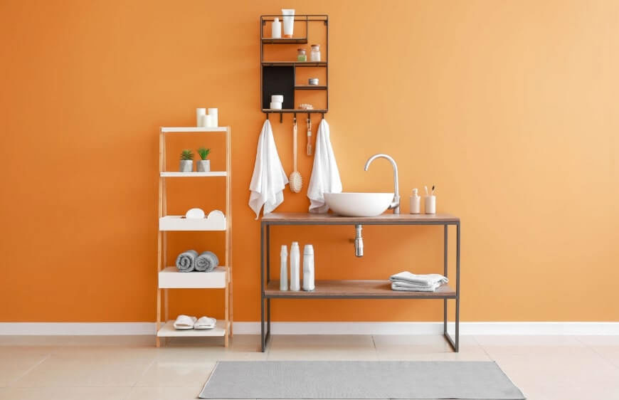
Emphasising that people may become bolder with vivid colours in this new, home-focused period, trend agencies are giving priority to butter yellow. Warm and soft in feeling, this colour also draws inspiration from the vitamin D provided by sunlight, bringing energy to bathrooms. Çanakkale Seramik’s Miniatile-Windsor collection combines yellow with the dynamism of metro-style tiles.
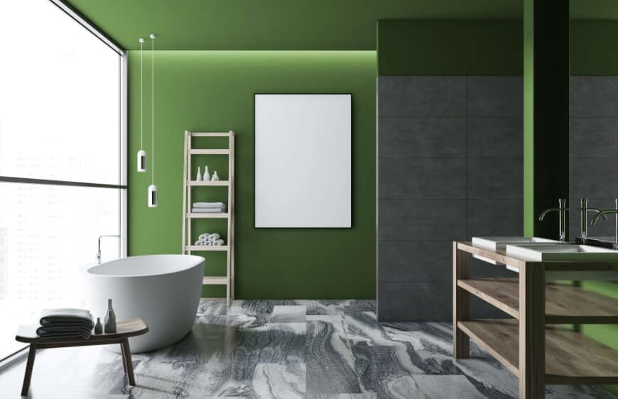
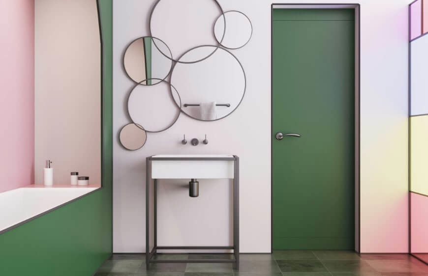
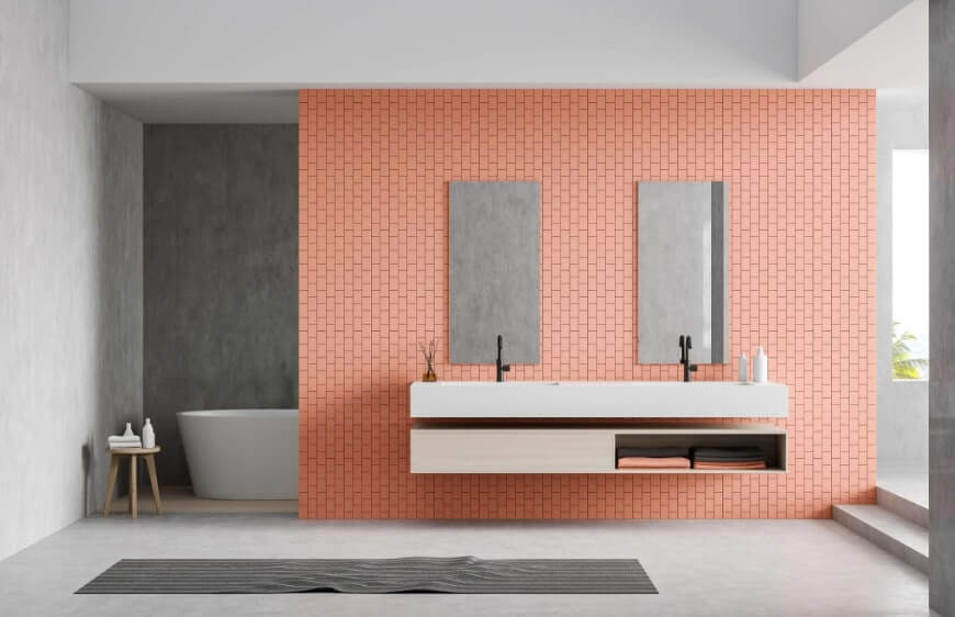
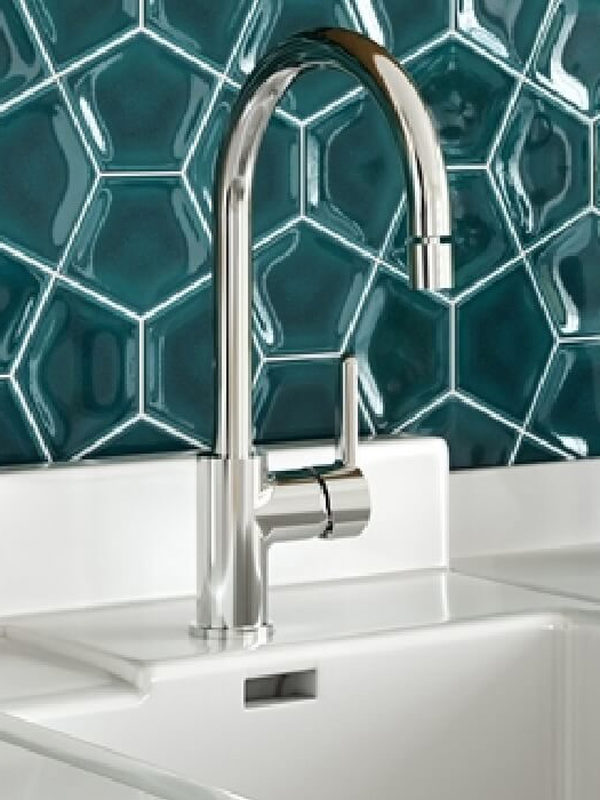
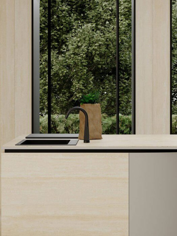
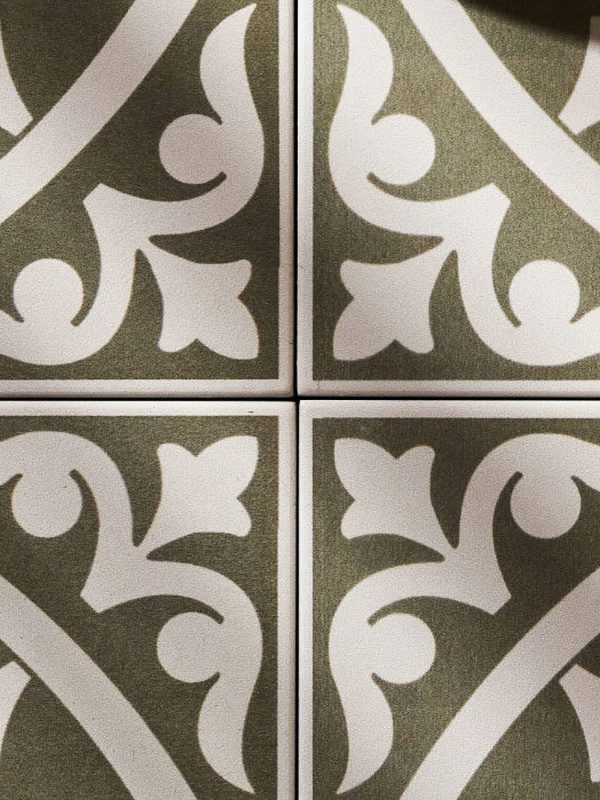
Olive green, a versatile and dependable core colour, is another forecast trend for bathrooms. Its compatibility with neutrals, muted character and matt quality create a restful atmosphere that clears the mind. Trend authorities combine olive green with avocado green, mango sorbet and orchid purple. The motivating colour of mango, India’s national fruit, will also be a favourite for bathrooms seeking a tropical influence.